/ Both&
Revitalizing, evolving, and leading design at Both& Apparel
Branding & Identity
Brand Refresh
Logo Refresh
Brand Guidelines
E-Commerce Website Design
Organic & Paid Media
Social Media Content
Creative Direction
Campaigns
Email Marketing Templates
Digital Ads
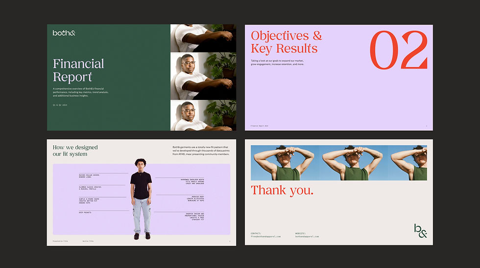
Presentation & Pitch Decks
Print Collateral
Lookbook
Both& was a startup company pioneering the category of nonbinary design in apparel and consumer goods.
My business partner Jess and I led a brand strategy and visual refresh project for Both&, working in close collaboration with the company’s CEO and founder Finnegan Shepard. Jess delivered a revised brand platform framework and GTM foundation, while I singlehandedly delivered a complete brand refresh, templates, guidelines, an e-commerce website redesign, and much more.
After delivering the refresh, I stayed on to lead and execute design across all aspects of brand, web, marketing, socials and beyond for Both&.
Team
Head of Design & Principal Designer - Myself
Director of Brand Strategy - Jess Wen
CEO of Both& and Copy Director - Finnegan Shepard
Photography - Mischa De Stroumillo
(See end of page for full credits)

The creative vision and philosophy of “both and ”
Both&’s founder had ambitions to create a unified brand identity that captures the philosophy behind the company, that not all bodies fit the binary; that the world exists beyond either/or.
While the brand had strong foundational elements (originally crafted by Liron Eldar-Ash), an evolution was needed to support our new creative vision, the company’s growth in offerings, and the expanded audience. Our goal was to create a design language that feels curated and trusted — classic with a twist of unconventionality.

BEFORE
AFTER
A logo for all purposes
The first item on the agenda was to redraw part of the logo to strengthen its overall form and versatility. I matched the weight of the ampersand to the other letters of the wordmark for consistency. These subtle, intentional improvements allow the new logo to scale down more effectively, and enables the ampersand to stand on its own as a graphic symbol.
The wordmark, monogram, and ampersand all work to create visual diversity within our brand system, each with a unique role to play.
Strengthening the ampersand was also crucial to our future vision, leveraging the symbol as a lockup device for partnerships or business expansions.

We are Both&
I established our visual design principles, tying them closely to the new strategic brand framework. Both& is aspirational, community-driven, unconventional, and trusted. These qualities are translated visually through highly curated original photography, specific design techniques (collage, repetition, asymmetry), and intentional use of typography.
The entire brand identity has an artistic, editorial layer that anchors every touchpoint. It is designed with room to flex from classic and professional to vibrant and expressive, depending on its function.


WORDS ABOUT OUR PARTNERSHIP FROM BOTH&’S FOUNDER & CEO FINNEGAN SHEPARD
“Both& needs someone who sees with a precision and perfectionism that most can’t. I very much appreciate that you can play that role, but that you are also flexible and business-minded enough to understand when and where compromise is okay, and when that line needs to be firmly drawn.”
“Of all the people I have hired, you are the person who most systematically takes care of things... You simply find problems before I even know they exist and then work to figure out a solution. This is invaluable (to any company) but especially to an early stage start up with a CEO who can’t keep track of everything. In essence, you are my rock.”
Credits
Photography:
Mischa De Stroumillo
Lydia Garnett
Bella Porter
Special thanks to:
Both& Founder & CEO - Finnegan Shepard
Brand Strategist & Business Partner - Jess Wen
Both& Socials & Community Manager - Anthony Rogers
Both& Operations Manager - Ellie Garza
Web Development - Jake Admire & Team at On/Sight
Web Support - André Mendonça